Time Visualisation is a very helpful tool to check if participants miss reads and if times are realistic, or in other words to identify potential errors in data.
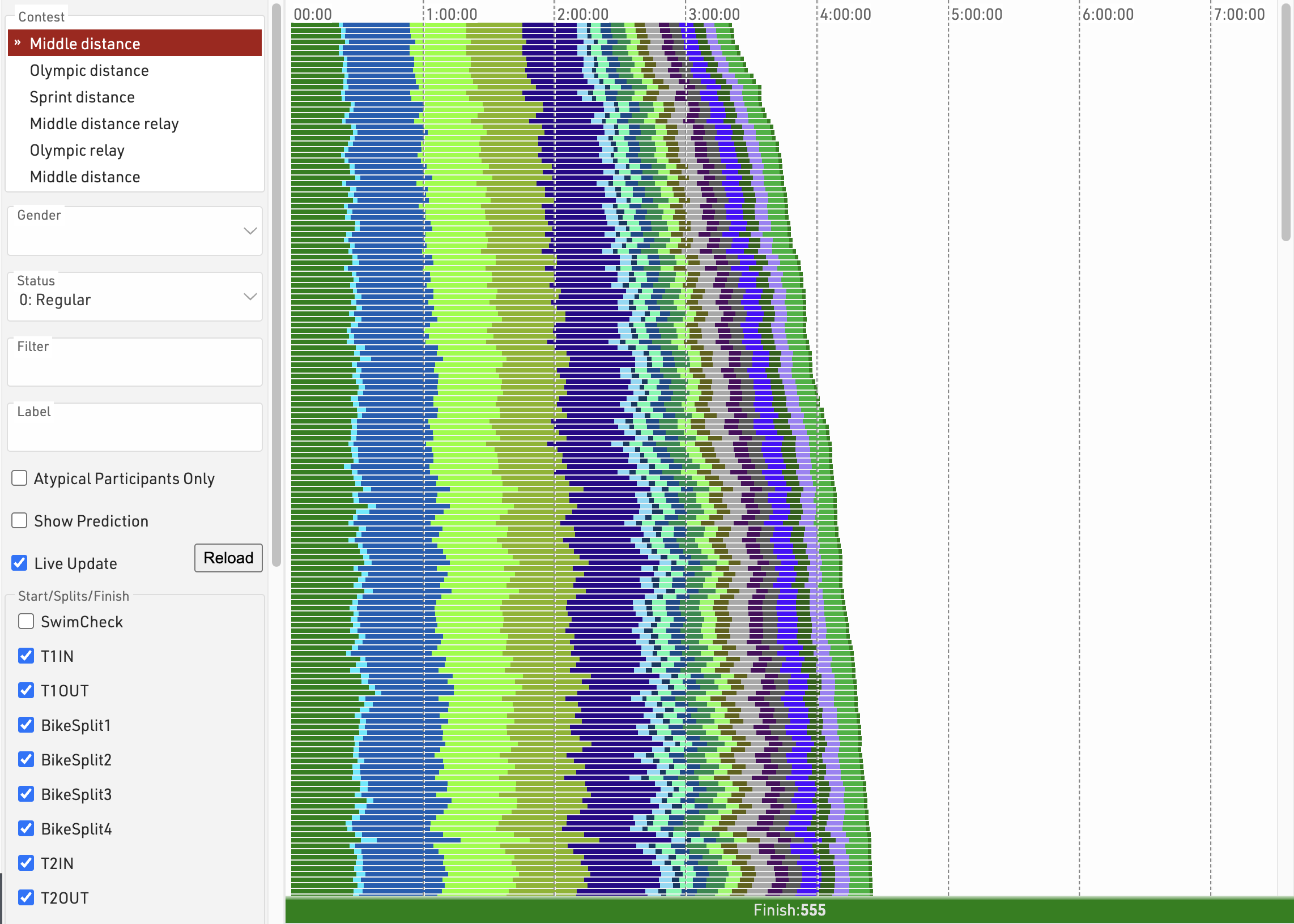
The tool shows one line for each participant. The different colors represent the section times between two split timing points. The length of the bar represents the time and the fastest athletes are at the top.
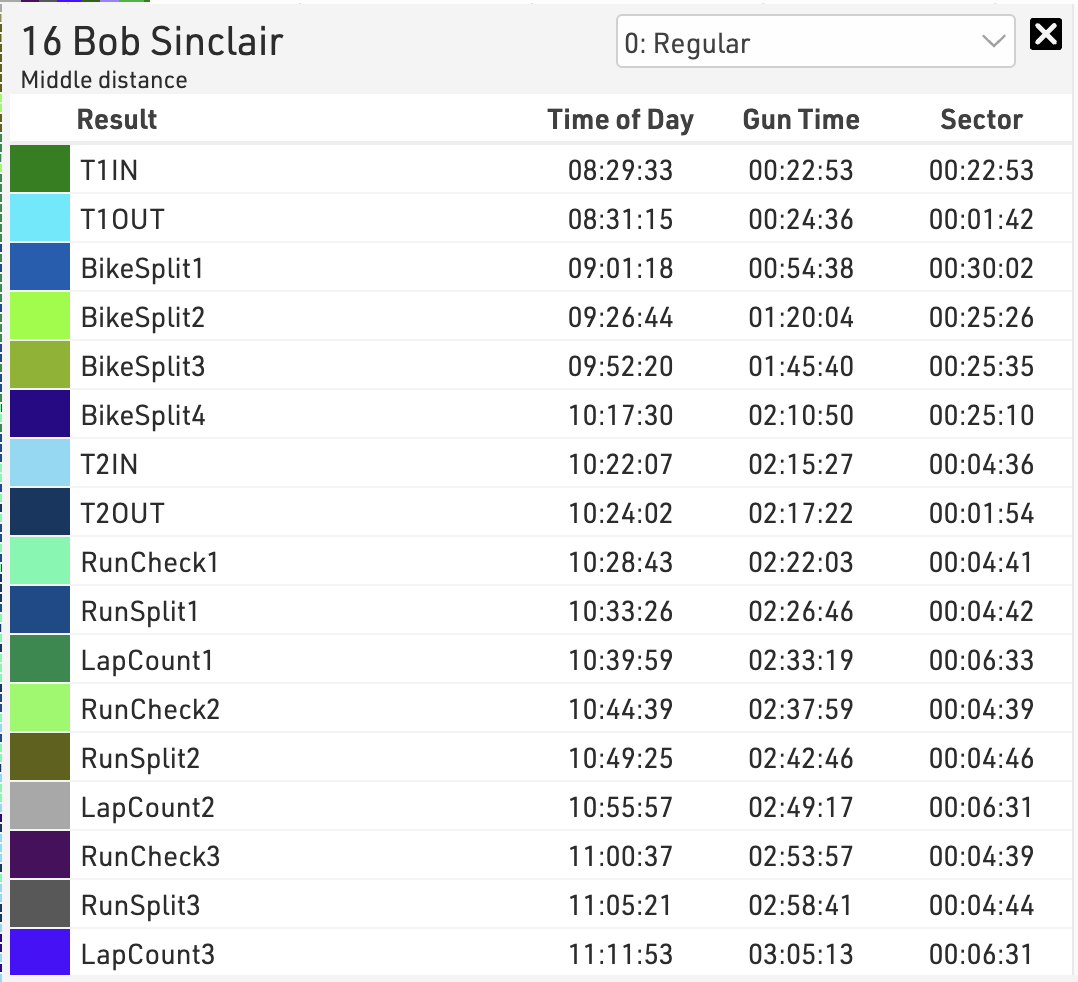
Clicking on a line will open a popup with the full details for that participant where you can additionally change their status.
Use the settings bar on the left to select the contest(s), gender, status or apply any other filter, you should also select the splits or results that will be part of the visualisation. Sometimes you may want to exclude certain times. Usually you will want to see just the key timing data for each Timing Point, not the intermediate split times.
A label can be applied to each line, which can be useful when comparing multiple contests together.
If you only want to see participants who are missing data then click "Atypical Participants Only", the view also has a live update checkbox which will refresh the visualisation as new Results are calculated, this is useful for monitoring a race whilst it is in progress.