The elements in each step are the form fields / display fields which are shown to the user.
Elements can be indented right / left to denote children of specific elements, or for creating special functions.
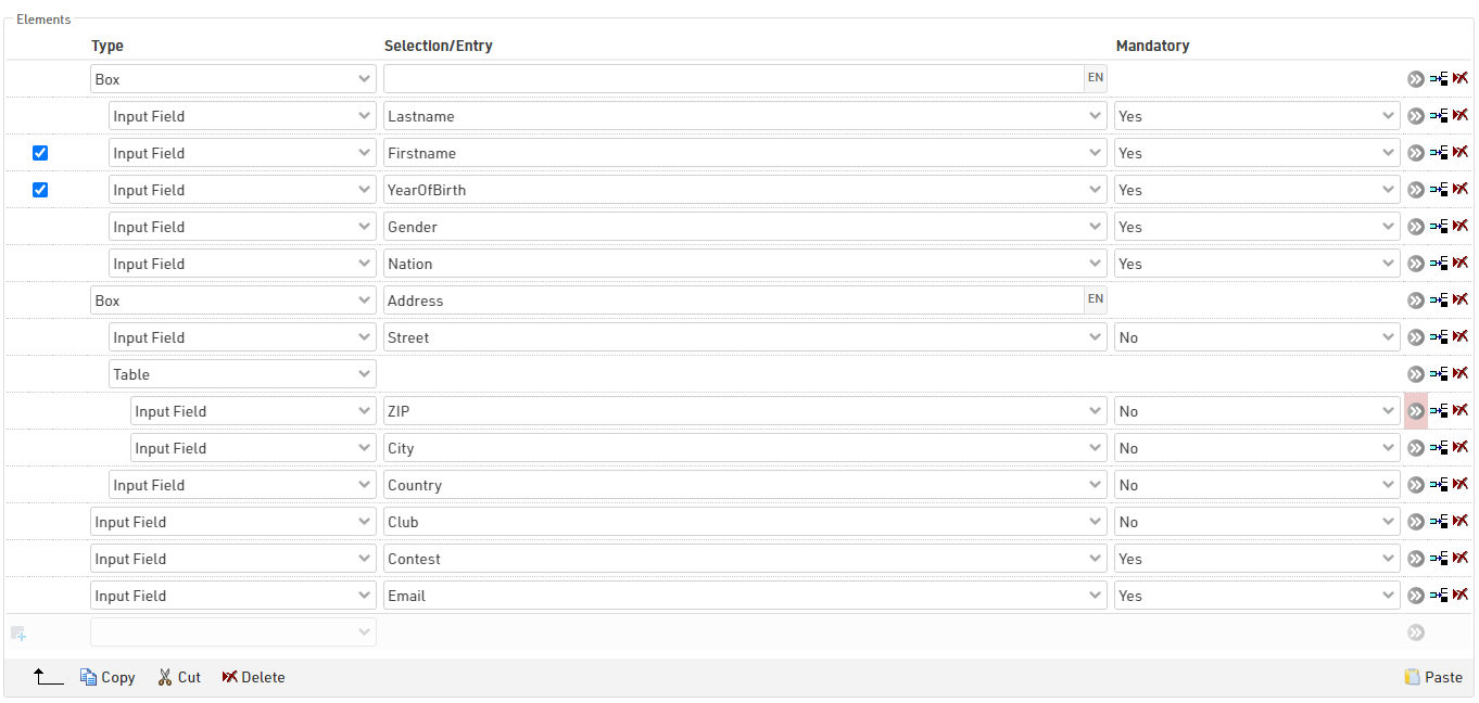
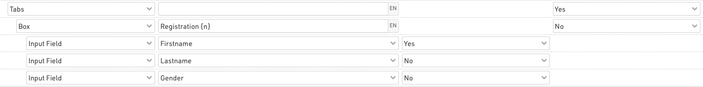
In group registrations elements can also be defined as common, when true the element will only be shown once, but the value will be saved for all registrations in the group (for input fields). Optionally fields can be only shown every nth line, this is useful when capturing distinct groups within a group registration.
Elements can be selected using the check boxes on the left side, when selected elements can then be copied, cut or deleted. Copied or cut elements can be pasted in, they will always be pasted in above the currently selected row.
This allows elements to be moved in batches within the same step, moved to another step, or moved to another registration form.
Element Types
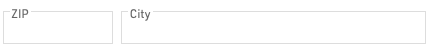
Input Field
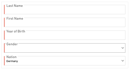
Input fields are used to capture data in the registration form, this can be captured for any of the default Participant Data Fields or Additional Fields.
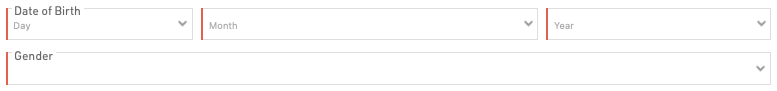
Most fields accept a standard text input. Some fields will generate special input fields such as dropdowns for Contest, Gender or Country / Nation and a special Date Input for DateOfBirth.
Additional fields will be displayed according to the field type.
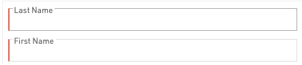
Input fields can be defined as mandatory, and when true must be filled in order to proceed to the next step, mandatory fields will be denoted by a red bar on the left border of the input.
Non-Editable Input Field
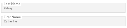
For use in self-service forms to show pre-existing data which should not be editable.
Text
Enter a standard fixed text, an empty text element can be used to create a break line between elements.
HTML
Create custom HTML elements in the form, useful for creating custom headers or additional links to external information.
Picture
Add pictures to the form from the pictures saved inside the event file, you must enter the exact file name, including file format. Use the picker to select or upload additional images.
Table
To create more compact views table elements can be used to add multiple fields to a single row. Direct children of the table element will be considered part of the table.
Box
Boxes are useful for grouping particular sets of fields together, this creates a card element which wraps around the children of the box.
A label can be given to the box which will be displayed at the top of the element.
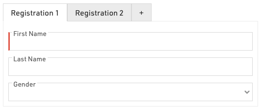
Tabs
Tabs can be used to create tabbed elements within a step to help keep the form more compact, this is most useful for Group Registrations to create a tab to fill in each individual's data. Each tab has a child element which is displayed, to display multiple input fields in a single tab wrap these in a Box.
In group registrations an additional + button is automatically added to the first Tabs element of a form which is common, this replaces the button to add more registrations.
To achieve this in a group registration the Tab element is common in the group registration and the Box containing the input fields is not common.
It is also possible to use Show Field / Expression Value to label the tabs with the names of each participant in a group registration, for example in a check page.
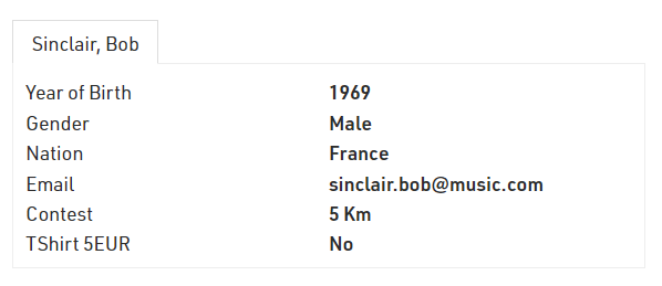
To achieve this, the first child of the tabs should be the Show Field / Expression Value and then the additional content of the tab should be a child of this.
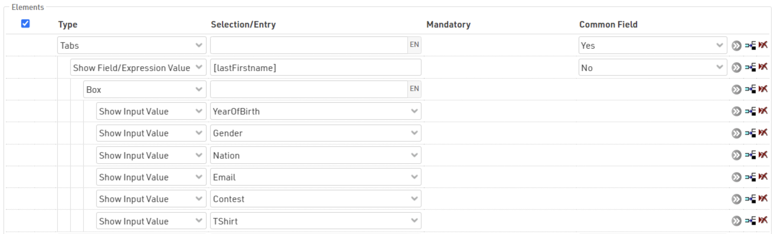
Show Input Value

Displays the label and value of an Input field which has been captured, normally used in a check page to display the individual details.
Show Field / Expression
Similar to Show Input Value but allows for any field or expression to be evaluated / shown. This could include derived fields such as FirstLastName or Age. Only the value is shown since there is no fixed label.
This option accepts HTML tags.
Show Entry Fees
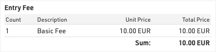
Creates a table which displays the calculated entry fees up to the point at which the page is generated.